I went on his dA and there's a few new single page drawings that are interesting because they look like he tried. I dunn though. Artfags discuss:
I'm just going to focus on these two since they're jumping out at me.
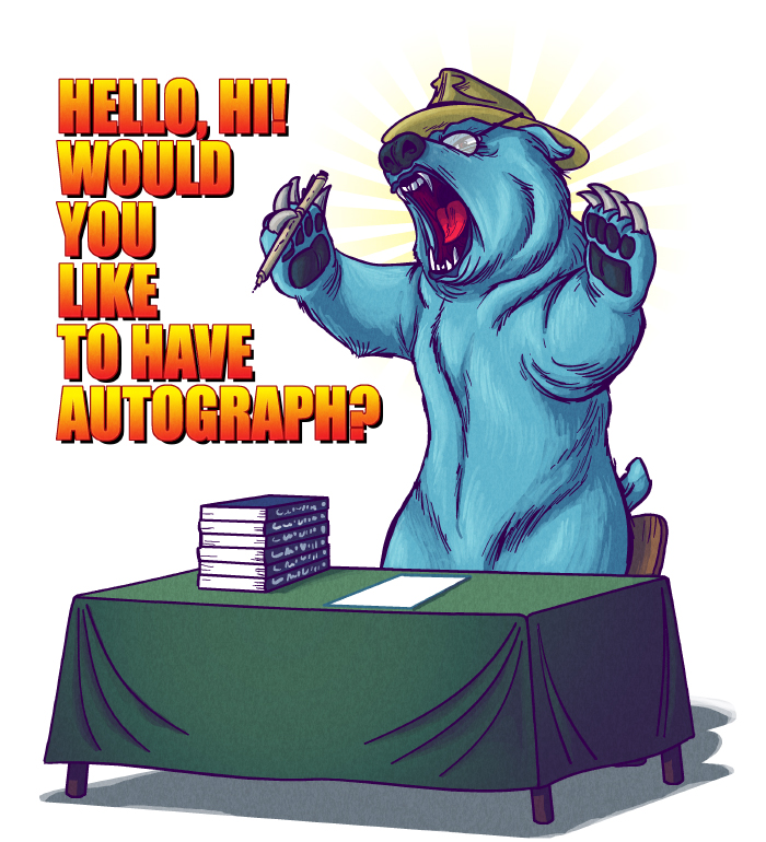
1. Holy shit is he... is he actually shading with blue? Instead of black? And those are definitely blue outlines instead of the thick shaky black outlines he uses on everything. I'll give him that, that's an improvement. To bad it's an improvement that has seemingly been dropped and never used on anything else. Bear anatomy is shaky. Its paws look weird and blocky, and it's got that cartoony humanized eye - animals do not have that much white showing in their eyes. Strange floppy ear and plushie-looking tail sticking out of its hip. Would be better, and make his joke better, if he went full realism on small details like that. Also, he still can't make it look like anything is actually holding anything, instead of things floating next to hands/paws in this case, not actually gripped or supported by anything.
4. Alright. What bothers me about this one? That chest - it does indeed look exactly like the chests look in skyrim. All of the fine lines and the small details appear to be there, it's accurate and you can tell exactly what it's supposed to be. And then crouching next to it is this pug-faced small-skulled thick-black-outlined scrawny disproportionate cartoon character. Why the hell does he not put equal amounts of effort into the character compared to the background object? Dobson cannot draw faces without putting a load of bold black lines all over the place that make them look like a fucking gremlin. Why does he draw eyes so far apart? Her face is too big for her skull, there is no room for her cranium, and that's made worse by the helmet, he draws it as though it were a skin-tight swimming cap or something. She's got some serious microcephaly going on there. It has already been mentioned that armor does not crack like eggs. But the worst bit here, to me, is the contrast between that character and that chest. Either he can draw if he actually cares enough about something to put actual effort and research into it - or, more likely, he can draw as long as he has something to directly COPY. They don't fit together. Either make them both realistic and detailed or make them both cartoony.
I've thought a couple of his skyrim drawings were halfway decent. The jokes aren't anything that
hasn't been made before, but they're still "yeah okay that is mildly humorous thing that happens in the game". But it's just downright weird what he chooses to put effort into. It is blatantly obvious he cares way more about things like
this than about his "original" concepts. And how the things he puts effort into only highlight the things he's still incompetent and lazy at, since he puts them right next to each other. Like faces. Holy mother of fuck the guy cannot draw a consistent and not-butt-ugly face to save his life.




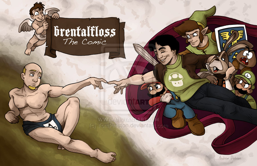


 " - The Comic
