💼 Careercow Andrew Dobson (aka Tom Preston)

Estado
No está abierto para más respuestas.
It's funny really. Dobsy's avatar complains about being soulless after the fill bucket, yet he looks just as wooden before the bucket. I mean I know my stuff is wooden (personal experience and all). But come on, an animation major should be able to do a lot better than... this.

Well I have noticed that his sketches look more appealing than his finished, inked work. It's his linework after inking, it becomes too thick, and probably also because there's no variety in the linework, I think you're supposed to vary how you do the lines, in terms of thickness and or how dark they are, I dunno.

But there's definitely something wrong with his digital linework. It does indeed sap whatever meager shred of appeal his sketches have.
 
Well I have noticed that his sketches look more appealing than his finished, inked work. It's his linework after inking, it becomes too thick, and probably also because there's no variety in the linework, I think you're supposed to vary how you do the lines, in terms of thickness and or how dark they are, I dunno.

But there's definitely something wrong with his digital linework. It does indeed sap whatever meager shred of appeal his sketches have.

Yeah, they're called dead lines (I think). Severe lack of line variation, every line has the same heaviness and there's no tapering of any kind. Makes a piece look... well, dead.

He doesn't do digital linework (or didn't, he might have changed- haha I doubt it)

znQHT.jpg
 
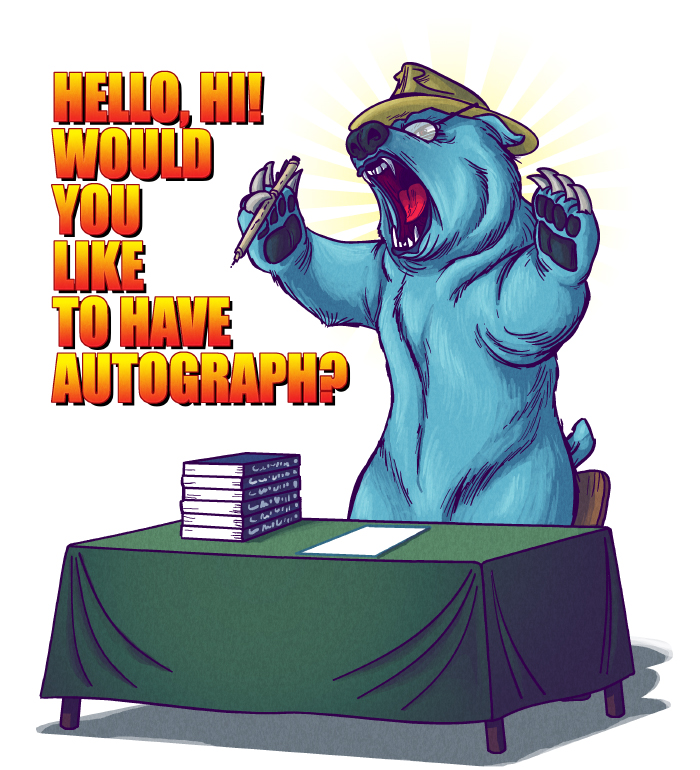
Not going to lie. I like the bear. Assumed it was fan Art at first. I figure an art critic could tear it a new one, but to my laymans eye it is impressive. Here is why it bugs me. Why doenst Dobson do realistic work more often? I recall some comic where he draws himself realistically and says "it's not as nice to look at." but to me (again, layman) it looked spectacular. Not on route to the Louvre, but leagues beyond his other stuff. Maybe it's personal bias. I mean, when I write or read, I prefer more adult stories. I feel like Dobson is the opposite. I think he is into... Younger stuff, if that makes any sense. Take his book idea. A children's book of rhymes, not an epic nordic Saga. This is why, I think, he'd look at this realistic self portrait that looks pretty good and go "pee yew. How unappealing. Now here is me as a cartoon bear interacting with characters fresh out of the funny pages. Much better." I don't know, maybe it's taste, but Ive always felt his realistic work is much MUCH better.
 
Última edición:
Yeah, they're called dead lines (I think). Severe lack of line variation, every line has the same heaviness and there's no tapering of any kind. Makes a piece look... well, dead.

He doesn't do digital linework (or didn't, he might have changed- haha I doubt it)

znQHT.jpg
I've seen dead lines used in animation, but that's because they need to make the drawings move. Dobsy doesn't have that excuse, so all his art looks like it's bland and lifeless. I mean aside from the fill tool.
 
Not going to lie. I like the bear. Assumed it was fan Art at first. I figure an art critic could tear it a new one, but to my laymans eye it is impressive. Here is why it bugs me. Why doenst Dobson do realistic work more often? I recall some comic where he draws himself realistically and says "it's not as nice to look at." but to me (again, layman) it looked spectacular. Not on route to the Louvre, but leagues beyond his other stuff. Maybe it's personal bias. I mean, when I write or read, I prefer more adult stories. I feel like Dobson is the opposite. I think he is into... Younger stuff, if that makes any sense. Take his book idea. A children's book of rhymes, not an epic nordic Saga. This is why, I think, he'd look at this realistic self portrait that looks pretty good and go "pee yew. How unappealing. Now here is me as a cartoon bear interacting with characters fresh out of the funny pages. Much better." I don't know, maybe it's taste, but Ive always felt his realistic work is much MUCH better.

Because that would require him to go outside of his comfort zone.

I think that's what's so frustrating about Dobby. He has the potential to be fucking great, should he want it, but he doesn't. He'd rather just whine.

And that's terrible.
 
I went on his dA and there's a few new single page drawings that are interesting because they look like he tried. I dunn though. Artfags discuss:

9DaAQ3i.jpg
LGFk054.jpg
cqtOAgb.jpg
ZAF9R65.jpg
1. It's refreshing to see Dobbie imagine himself as something which is awesome and not some cutesy-wootesy blue teddy bear or fussy "Nice Guy" loser.

2. Miyamoto soon came to regret his latest creation, thus bringing about the GamerFlood.

3.+4. This is completely wrong - everyone knows that female armor covers 5% of the body at maximum. And that bear is homesick for Poland and his platoon.
 
I don't know why people love Dovahbear so much, Bearserk is so much better.

 
I went on his dA and there's a few new single page drawings that are interesting because they look like he tried. I dunn though. Artfags discuss:
9DaAQ3i.jpg
ZAF9R65.jpg
I'm just going to focus on these two since they're jumping out at me.

1. Holy shit is he... is he actually shading with blue? Instead of black? And those are definitely blue outlines instead of the thick shaky black outlines he uses on everything. I'll give him that, that's an improvement. To bad it's an improvement that has seemingly been dropped and never used on anything else. Bear anatomy is shaky. Its paws look weird and blocky, and it's got that cartoony humanized eye - animals do not have that much white showing in their eyes. Strange floppy ear and plushie-looking tail sticking out of its hip. Would be better, and make his joke better, if he went full realism on small details like that. Also, he still can't make it look like anything is actually holding anything, instead of things floating next to hands/paws in this case, not actually gripped or supported by anything.

4. Alright. What bothers me about this one? That chest - it does indeed look exactly like the chests look in skyrim. All of the fine lines and the small details appear to be there, it's accurate and you can tell exactly what it's supposed to be. And then crouching next to it is this pug-faced small-skulled thick-black-outlined scrawny disproportionate cartoon character. Why the hell does he not put equal amounts of effort into the character compared to the background object? Dobson cannot draw faces without putting a load of bold black lines all over the place that make them look like a fucking gremlin. Why does he draw eyes so far apart? Her face is too big for her skull, there is no room for her cranium, and that's made worse by the helmet, he draws it as though it were a skin-tight swimming cap or something. She's got some serious microcephaly going on there. It has already been mentioned that armor does not crack like eggs. But the worst bit here, to me, is the contrast between that character and that chest. Either he can draw if he actually cares enough about something to put actual effort and research into it - or, more likely, he can draw as long as he has something to directly COPY. They don't fit together. Either make them both realistic and detailed or make them both cartoony.

I've thought a couple of his skyrim drawings were halfway decent. The jokes aren't anything that hasn't been made before, but they're still "yeah okay that is mildly humorous thing that happens in the game". But it's just downright weird what he chooses to put effort into. It is blatantly obvious he cares way more about things like this than about his "original" concepts. And how the things he puts effort into only highlight the things he's still incompetent and lazy at, since he puts them right next to each other. Like faces. Holy mother of fuck the guy cannot draw a consistent and not-butt-ugly face to save his life.
 
Because that would require him to go outside of his comfort zone.

I think that's what's so frustrating about Dobby. He has the potential to be fucking great, should he want it, but he doesn't. He'd rather just whine.

And that's terrible.
No, it's not that he has potential to be great that's the real tragedy with Dobson. There is a huge market for talentless hacks of writers/artists and they generally get a ton of freedom as well as admission into the comic industry hugbox where you're not allowed to do anything but give your fellow artist/writer asspats and defend from misogynerd trolls.

If Dobson sent his portfolio to any comic company save for DC or Marvel, he'd be hired within a week. That wouldn't even require him to do work. Not only that, but the "oh companies need shitty artists to work quickly, Dobson would fail" argument sadly applies even less now. Hell, all he would really have to do some places is ask friends/acquaintances if he can write/draw for a book of a property they are on.

The comic book industry is absolutely perfect for someone like Dobson to get into at the moment, and it doesn't even require much effort. Even so I don't expect him to.
 
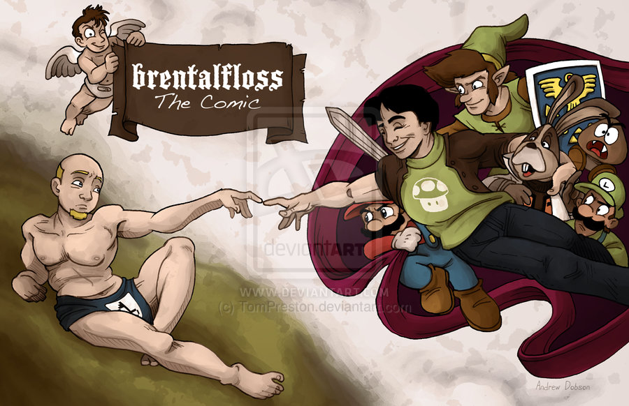
The Brentalfloss one is the worst by far. Just like with the Kanto Pokemon group picture everything is fucking shades of brown. Something that could have been fun is instead dull and lifeless. You can also tell which characters he cares more about by the amount of effort put into them:
  • Link - By far the only one Dobson really gives a shit about. Even though Link isn't supposed to be the focus of the image Dobson has unintentionally made him the focus by putting the most effort into Link (compare Link's lineart and shading to everyone else). Of course because this is Dobson that's not saying much, and it helps that Link is mostly hidden. And even though extra effort seems to have gone into Link, that hasn't stopped him from looking thoroughly unappealing. Also, none of this applies to Link's sword and (especially) shield, but more on those in a bit.
  • Miyamoto and Brentalfloss - The real focus of the picture. The anatomy on these two feel really off to me. I strongly suspect that when Dobson referenced from the original fresco he didn't fully grasp the anatomy, or just didn't care, so long as it looked sort-of like the original but in his style. At any rate it comes off as incredibly awkward.
  • Mario and Luigi - Actually I think these two are the best looking out of everybody, but it helps that their designs are simple and they're partially or mostly hidden here. However I don't think Dobson put as much effort into them as he did the previous three. The shading on these two feels a lot more half-assed, especially compared to Link. And Mario has a blob for a hand.
  • Peppy - Peppy's lineart has a clearly wobbly look to it compared to the previously discussed, which shows Dobson didn't care about making it look smoother. I get the feeling Dobson doesn't particularly like Peppy or the Star Fox games, but included him either by request or because he knows the games are popular. It's also worth noting that overall brown coloring probably hurts Peppy the most because everybody around Peppy seems to be merging into him.
  • Random angel in the corner - Blob hands, blob feet, horrible wings. It feels like a rushed afterthought. Also I only just now realized what looked to be some sort of logo on the underwear is probably supposed to be a pin. So I guess he's actually wearing a diaper? It doesn't look like a diaper though. And it would only take a couple of lines to achieve that. Leave it to Dobson to draw extra lines on faces but draw a white blob and we're expected to know it's a diaper. On an angel with a full head of hair. I get that he didn't want to have nudity given the subject matter, but the poorly drawn diaper makes it feel even more awkward then before.
  • Link's sword - Jagged and lopsided. Based on how long Link's arms ought to be in this picture it's not far enough out from Link, and rather short to boot. I would expect Link's forearm and hand to be visible, and the entire sword would be in the shot. The shine effects on the sword also feel awkward, but at least it looks like it's actually in the same space with Link.
  • Link's shield - Looks like it was drawn and colored in five minutes. God dammit how can you put the most care and effort into a character but don't extend that to his accessories? Link's shield is a lot better looking then that in the games! Not to mention he didn't even fucking shade it! Even though Peppy's shadow is (sort of) reflected onto it, it doesn't look like it's in the same space with them at all.
  • Goomba - Hahaha, I forgot all about this guy. Big surprise, he doesn't stand out and is beyond half-assed. This is total Dobson-didn't-give-a-shit territory here. Probably only included because Dobson had a big empty space to fill in near the end.
 
Última edición:
His realistic stuff looks way better than his stiff as fuck cartoon drawings. Too bad he's too dense to realize that constant bitching is not gonna get him anywhere.
I dunno, his realistic stuff looks pretty bad, and sometimes worse than those drawings. Might be because those ugly expressions look worse when applied to a realistic facial construction.

On the other hand it could just be me.

I went on his dA and there's a few new single page drawings that are interesting because they look like he tried. I dunn though. Artfags discuss:

9DaAQ3i.jpg
LGFk054.jpg
cqtOAgb.jpg
ZAF9R65.jpg
Where to begin?
1. Well, I'll give him this, he didn't shade with black this time. But that's about it. The bear looks like someone just dawned a bear costume due to its more human-like proportions. Those eyes are equally unfitting as bears don't normally have prominent white (unless you're a Berenstain Bear, but even those books have better art than this). Also, why is the table also given a blue tint?
2. All I can think about is Luigi's "Dat ass" stare towards Miyamoto. But in a critical sense, this is probably the worse in regards of quality, and we're already at a low standard with Dobsy. Mario's hand looks like a mitten more than a glove. Link clearly got a botched nose job. Peppy looks drunk, the Goomba and the angel look like they were added in at the last minute, and the anatomy on Brentalfloss and Miyamoto looks fucked up.
3. SWEET JESUS those faces, if those don't prove my point. I don't know what will. Same thing I said about the first picture applies with the bear here.
4. I'd praise the treasure chest if I didn't think that was just traced. The perspective's screwed up and neither the character or chest mesh that well together. Oh, and it looks like that black shading is back.
 
Última edición:
1. Holy shit is he... is he actually shading with blue? Instead of black? And those are definitely blue outlines instead of the thick shaky black outlines he uses on everything.
It looks to me like he's applied an Instagram-like colour LUT on a regular drawing. The shaded part of the table is a bit of a giveaway.

"True artist born in le wrong generation :'(" - The Comic
 
Última edición:
Wait, what the fuck, it's like he just read my post.

I know it was a coincidence, but the irony is seriously insane here that he's using a gif that I used to make fun of him to disparage Other People WHO ARE TOTALLY NOT HIM BECAUSE THE BRILLIANT TOM PRESTON NEVER COMPLAINS ON THE INTERNET EVER.

It's not like he made petty complaints about Gamergate and comic books just hours before and after making that tweet.

screenshot-twitter com 2015-04-18 13-35-15.png


screenshot-twitter com 2015-04-18 13-38-15.png


nope, never

screenshot-twitter com 2015-04-18 13-43-48.png


screenshot-twitter com 2015-04-18 13-45-03.png


You can tell he doesn't have a lot of real concerns in life when the things he decides to whinge about matter about as much as he does.

edit:
Did Dobs retweet that Spike tweet?

Yup. Nimbus Screenshot was acting up today though, so I could only upload the tweet without the notification that Dobson retweeted it.
 
Última edición:
Estado
No está abierto para más respuestas.
Atrás
Top Abajo