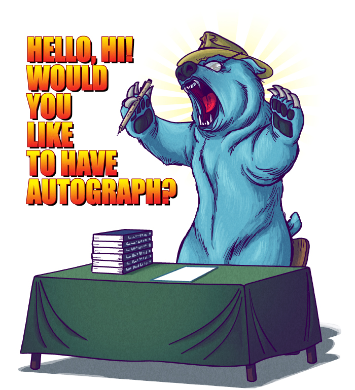
Claws are awkward lookings, using noise pattern with gradient on table. Shading on the side of the table. Legs uneven. Arm on the Right seems too rounded and out of place. Tail in wrong position.
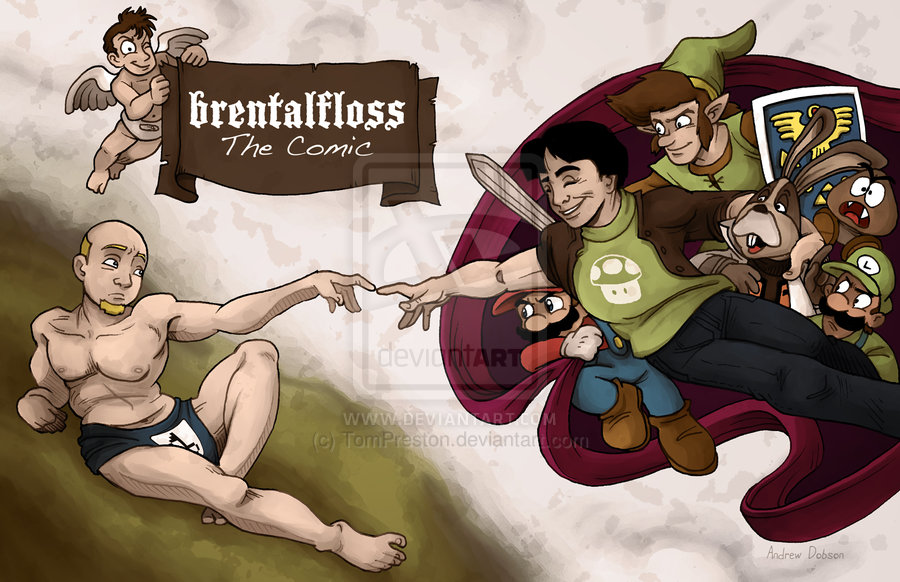
Guys face is fucked, hands look like they're broken, check out that dudes fucking belly. Miamoto looks like a woman, link's nose. Bland shitty palette, using Earthtones for what would be a cheery work.
If he's mimicking traditional works he should of dropped the outlines and shat on the colouring.
If the same character as below she looks entirely different, scratchy 'shading' - lighting amibigious (why is there lighting in the inside of the left leg? Bears head expands in helmet. Bear's nose looks puglike. Bears feet and hands bad.
Armor doesn't shatty like fabric, IIRC, left-most leg looks too long and at a wrong angle, looks like double eyebrows. Hand on chest looks too big(?). Cobwebs on the side of the chest should of broken unless the chest was positioned open for the spider to make it like that. Moth (you know because its got nothing in it) looks more like a Fly. Different chestpiece than previous character, skirt, looks to masculine (if its a woman)