Tanti-Fanti
kiwifarms.net
- Registrado
- 17 de Ene, 2018
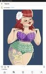
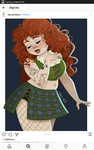
The fucking tumblr nose man. All those pictures would be so much better without it. I can't believe people defend it so fucking much. Red noses only work if your character's undertone is the same color.
What many of these artists fail to understand is that because they don't study how skin works, is that undertones are what make or break a character's skin tone. For example, You can have a character with light skin, but then an experienced artist would ask..what type of light skin? Is there going to be a slight gold tint or is it going to be reddish? This shit is important because having characters with undertones that don't match their image looks so awful. Many artists who usually know what they're doing have characters designs match the undertone and character's clothing. These artists do not. Everything is haphazardly put together. A character can have a muddy gold undertone, but wait! He's wearing a pure white shirt and bright rainbow pants and it just makes it pain on the eyes.
For example, with these artists I noticed that they didn't even pick a decent undertone for their skin. The undertone isn't greatly defined either. All of it is a muddy gold or reddish brown which is so unpleasant to look at. NO ONE has that type of skin. Even in real life, people don't have these awfully saturated undertones for skin, it's either usually very desaturated (pale pink) or super high in value (reddish color). If you really wanted to represent people, you can do them a favor and draw from a reference. Or in any other case, learn to pick colors that aren't muddy brown.
What many of these artists fail to understand is that because they don't study how skin works, is that undertones are what make or break a character's skin tone. For example, You can have a character with light skin, but then an experienced artist would ask..what type of light skin? Is there going to be a slight gold tint or is it going to be reddish? This shit is important because having characters with undertones that don't match their image looks so awful. Many artists who usually know what they're doing have characters designs match the undertone and character's clothing. These artists do not. Everything is haphazardly put together. A character can have a muddy gold undertone, but wait! He's wearing a pure white shirt and bright rainbow pants and it just makes it pain on the eyes.
For example, with these artists I noticed that they didn't even pick a decent undertone for their skin. The undertone isn't greatly defined either. All of it is a muddy gold or reddish brown which is so unpleasant to look at. NO ONE has that type of skin. Even in real life, people don't have these awfully saturated undertones for skin, it's either usually very desaturated (pale pink) or super high in value (reddish color). If you really wanted to represent people, you can do them a favor and draw from a reference. Or in any other case, learn to pick colors that aren't muddy brown.