Sonichu [Fan Comic] Rosechu's Story - A reimagining of the Sonichu story from Rosechu's perspective.

It's that time of the month again!
(No, not THAT "that time of the month", the other one)
lSNaQ2s.gif


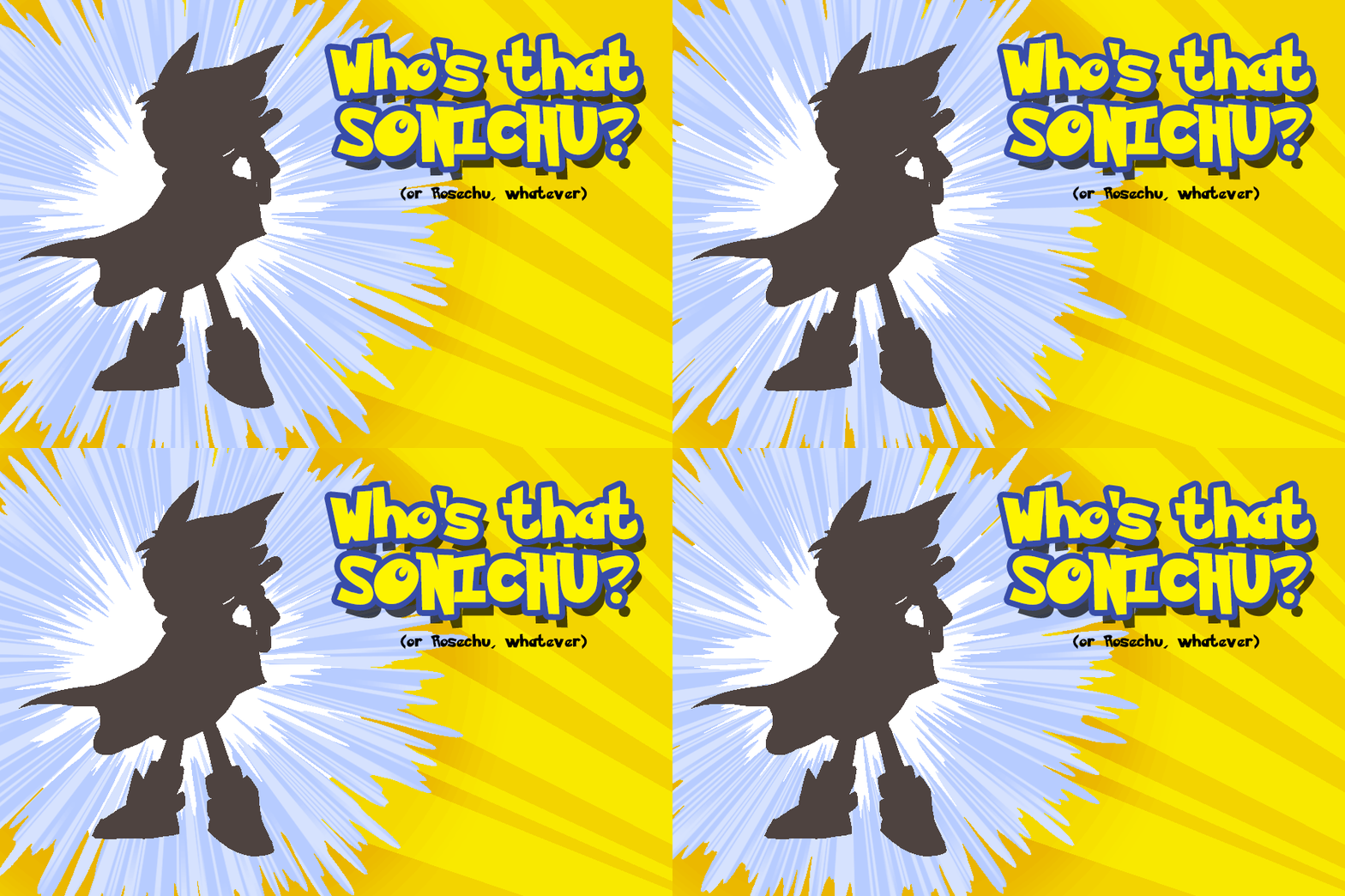
You guys know the game by now, guess which canon Sonichu (or Rosechu) is silhouetted here. You have one week to guess who it is.

This time, though, in an effort to make it more interesting, I'm going to be giving everyone a score. I'll be doing this at my own discretion, so getting the right answer won't necessarily get you a good score. This is mostly to experiment, though. If it turns out to be a fun idea, we'll keep on doing it.

Daring chu of mystery

Champion of right

Swoops out of the shadows

Darkbind owns the night

Somewhere some villain schemes

But his number's up


(3-2-1)


Darkbind Sonichu (When there's trouble you call DB)

Darkbind Sonichu (Let's get zappin’)

Darkbind Sonichu (Darkwing, Darkbind Sonichu!)


Cloud of smoke and he appears

Master of surprise

Who's that cunning mind behind

That shadowy disguise

Nobody knows for sure

But slanderous trolls are out of luck


'Cause here comes (Darkbind Sonichu)

Look out! (When there's trouble you call DB)

Darkbind Sonichu (Let's get zappin)

Darkbind Sonichu (Better watch out, you slanderous trolls)

Darkbind Sonichu
 
Última edición:
Holy snackcrackers, I'm on time? AND I put out a Who's That Sonichu just yesterday? Looks like I've been pretty industrious lately. Especially since the water in this page was a pain in the ass to get right...

fTvBQQo.gif
 
*snaps his fingers* Shoot, wasn't sure if you were posting a page today or not. Sorry for butting in on your usual post day.

Anyway, cute as always. I really like the way you depicted the water- it's simple and yet it has a lot of motion to it. Now, here's hoping the two don't get electrocuted, else this might turn out to be a very short comic.
 
Holy snackcrackers, I'm on time? AND I put out a Who's That Sonichu just yesterday? Looks like I've been pretty industrious lately. Especially since the water in this page was a pain in the ass to get right...

fTvBQQo.gif
*snaps his fingers* Shoot, wasn't sure if you were posting a page today or not. Sorry for butting in on your usual post day.

Anyway, cute as always. I really like the way you depicted the water- it's simple and yet it has a lot of motion to it. Now, here's hoping the two don't get electrocuted, else this might turn out to be a very short comic.
You two are syncing up something crazy. lol
 
*snaps his fingers* Shoot, wasn't sure if you were posting a page today or not. Sorry for butting in on your usual post day.

Anyway, cute as always. I really like the way you depicted the water- it's simple and yet it has a lot of motion to it. Now, here's hoping the two don't get electrocuted, else this might turn out to be a very short comic.

Not your fault, I'm a bit inconsistent about whether a new WTS means no comic for the week or not, I probably should have said something.

Anyway, not sure about them getting electrocuted, but...
 
It's that time of the month again!
(No, not THAT "that time of the month", the other one)

lSNaQ2s.gif


You guys know the game by now, guess which canon Sonichu (or Rosechu) is silhouetted here. You have one week to guess who it is.

This time, though, in an effort to make it more interesting, I'm going to be giving everyone a score. I'll be doing this at my own discretion, so getting the right answer won't necessarily get you a good score. This is mostly to experiment, though. If it turns out to be a fun idea, we'll keep on doing it.

It's a Vamprosa wielding a baseball bat.

Or Darkbind, y'know, whichever. I'm not entirely sure though, since it looks like there's a bump on his face, as if he's wearing goggles or glasses. Plus, I think his shoes are a little different, Darkbind's don't seem to have those little wing thingies on them.
 
It's that time of the month again!
(No, not THAT "that time of the month", the other one)

lSNaQ2s.gif


You guys know the game by now, guess which canon Sonichu (or Rosechu) is silhouetted here. You have one week to guess who it is.

This time, though, in an effort to make it more interesting, I'm going to be giving everyone a score. I'll be doing this at my own discretion, so getting the right answer won't necessarily get you a good score. This is mostly to experiment, though. If it turns out to be a fun idea, we'll keep on doing it.

It's Darkbind.
Or Frog from Chrono Trigger if you listened to the audiobooks.
 
Okay, so I need your guys' opinions on something: Up until now I've been doing a pixelated style for the comic. This is for several reasons, but one of the big ones is because it allows me to color the pages faster without having to deal with anti-aliasing.

However, it seems like I can have the best of both worlds: lineart that is not only smooth, but not a pain in the ass to color in. I don't know how I never thought of it, or come across this technique before, but I feel incredibly silly for not seeing this sooner.

This is where you guys come in, though... I like the way the lineart looks when I do it like this, and it takes almost zero extra effort to do (a little more RAM, maybe, but my PC can handle that) but I don't know if I should change the fundamental look of the comic after this long. I've experimented a lot as the comic has gone on, but is this maybe too much?

hnU4aQX.gif


Here's a comparison image (as well as a sneak preview of the next page) so you can get an idea of what the new style might look like.
 
Oh gosh, so sorry I'm late to the page! I had to deal with a lot of spyware recently, luckily I may have found a temporary solution to it.

BUT ENOUGH ABOUT THAT! This page rocks, it's both heartwarming and even kind of both funny and sad by the end of it. Rosechu spreading her arms out is totally giving me Titanic vibes...the movie, not the actual disaster.

As for the pixelated vs. lineart decision, I think they both look good. However if lineart really doesn't take you that long to do and your computer can handle the extra RAM, I'd say go for it. Although again, they both look good and unless I look closely, I really can't tell much of a difference, so I don't think it's too much of a jarring departure from the previous style...although I probably can't judge that just yet since the next issue isn't finished yet. I could be wrong there, it could very well be more noticeable in the actual comic, but either way I'd say it wouldn't hurt to try it out.
 
I like them both. Maybe it's just because it's such a distinctive style, but I've gotten really fond of the pixelated. It definitely makes the comic stand out from other styles. But ultimately it's up to you!
 
I prefer the "After" version. It just looks, I don't know, cleaner? Is that the right word for it?

Cleaner and smoother, wouldn't you agree Zach?

But at the same time the pixelness is kind of cute, like it's done on purpose. Like an homage to the old pokemon games. Remember those? You and I used to argue on which starter we thought was the best.... Anyway, they're both really quite nice, I dont know Zach, think it might have to come down to a coin flip.

I'm sorry, I've been dying to make a reference to your username since I've first noticed it.
 
Personally, I am of the opinion that you should do what's most convenient for you: whichever line style you like best. The art is charming and endearing no matter how the outlines look. :)
 
Atrás
Top Abajo