
Arcanineinchnails
kiwifarms.net
- Registrado
- 7 de Jul, 2015
What a half assed attempt at art.
Sigue el video de abajo para ver cómo instalar nuestro sitio como una aplicación web en tu pantalla de inicio.
Nota: Esta función puede no estar disponible en algunos navegadores.

That's it? Couldn't have taken more than 30 minutes to shit that out.

Ah geez. I can see why he was late with that one. Seriously, he had to use like 2 photoshop effects or something, it's a testament to Dobson's prowess as an artist to produce such a magnificent piece of art within such a short timespan, even though he didn't make the deadline!Here's the wallpaper guys (spoilered because its a big picture):

Wow. That's lame.Here's the wallpaper guys (spoilered because its a big picture):

Here's the wallpaper guys (spoilered because its a big picture):


Called it.Here's the wallpaper guys (spoilered because its a big picture):


That looks so out of place. It's like he just slapped it on the background. Or he just slapped in the background, just like that previous wallpaper. If I were a patron I'd be noping far far away from this waste.Here's the wallpaper guys (spoilered because its a big picture):


Last I checked Dobson threads are banned on 4chan's /co/ board.Nigger please. 4chan? ED? Get with the times gramps, i'd bet my last dollar that the farms are the only ones that care these days.

With Dobson, if there's a will, there's a way.It's incredible. Every time I think we've hit the bottom of the barrel, Dobson reminds me that there is no bottom. This is such an obvious rush job that it's unbelievable.
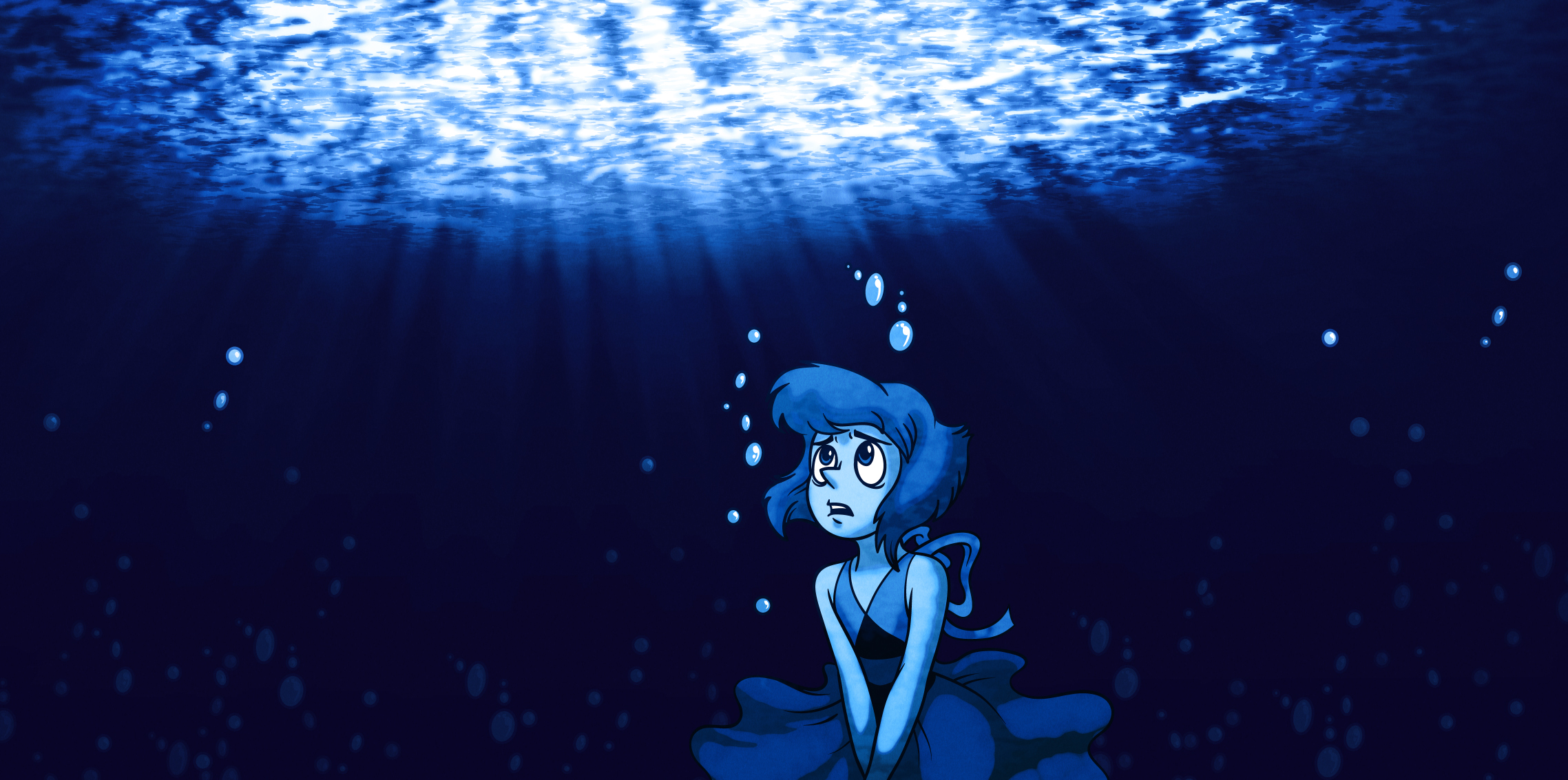
1. The frame is almost entirely empty. Seriously? He couldn't even copy/paste some seaweed into the picture? A starfish? Anything to look at?
2. That pose. The best evidence of Dobby's regression--he actually hid the hands out of frame so he wouldn't have to draw them. Lots of artists I know used to do that...when they were 10. How old is Dobby again?
3. That face. I think he was trying to make her look somber, but it just comes off like she's sitting on a hard rock or has a bad itch.
4. Obvious photoshop rendering is obvious. And also really ugly, even for how he usually uses it.
5. Perspective. He tried to make it look like she was staring up at the surface, but because of how poor the surface rendering is and how flat the figure looks, the two don't look like they exist on the same plane. I honestly wouldn't be surprised if he just copy/pasted her onto of the background and called it a day.
Everything else is pretty much what I've come to expect from him by now: copy/paste bubbles, flat shading, no sense of composition. Seeing how these get progressively lazier every month, I honestly don't know what to expect next. Is it possible to put in less effort than none?


Here's the wallpaper guys (spoilered because its a big picture):


