
- Registrado
- 27 de Mayo, 2015
Again, Dobbo's Korra lesbian fapping comes to the fore: "I don't want a well-crafted comic, complete with a good story! Just give me a dyke soap-opera!"
Sigue el video de abajo para ver cómo instalar nuestro sitio como una aplicación web en tu pantalla de inicio.
Nota: Esta función puede no estar disponible en algunos navegadores.

Oh I must've missed that one. The ones I've seen were his character wearing elven armor with those godawful faces.
I just can't really imagine how you can't kill in Skyrim, or at least be forced to kill in order to survive. Sure you can run away, but what about boss fights?
Snagged from ED:
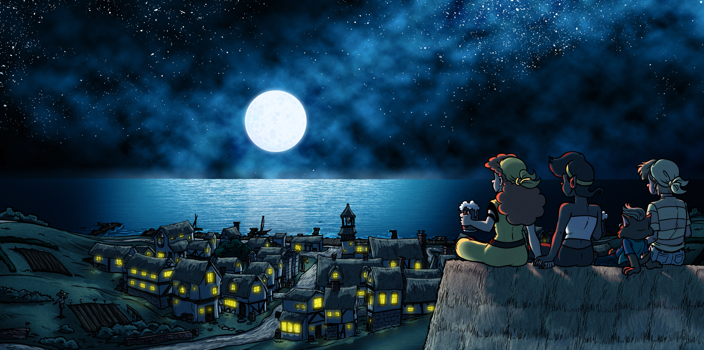
So apparently this is a wallpaper?
How are they not falling? What is perspective? How is that...thing between ratgirl and token straight guy leaning backwards?
The roof(?) they're sitting on looks flat as fuck. And that cloud filter.


Flaws aside, I give it a C+ for effort.Oh I must've missed that one. The ones I've seen were his character wearing elven armor with those godawful faces.
I just can't really imagine how you can't kill in Skyrim, or at least be forced to kill in order to survive. Sure you can run away, but what about boss fights?
Snagged from ED:
So apparently this is a wallpaper?
How are they not falling? What is perspective? How is that...thing between ratgirl and token straight guy leaning backwards?
The roof(?) they're sitting on looks flat as fuck. And that cloud filter.


That could have been really good if he actually looked up some tutorials on doing clouds, for instance
He did, he just did it back in the 90s when "Filter > Render > Clouds" was how most people did it.
His sea is also basic noise with a motion blur on top of it then upscaled. Probably would have benefitted from some slight curvature and haze at that horizon so it doesn't look like a flat vertical slab.
This would have been one of his better pieces if he didn't cheap out at the last minute

this is the point where the laziness is just plain abstract.

Aside from terrible lighting (does Dobson know how shadows work? Why do the people glow red?), the town looks sorta comfy. I'll give him that. The coloring is decent, I'd say. The glow from the windows should be a bit less jarring (yellow would work, but that yellow is too strong) - maybe a bit more like a.mber or dark honey.Oh I must've missed that one. The ones I've seen were his character wearing elven armor with those godawful faces.
I just can't really imagine how you can't kill in Skyrim, or at least be forced to kill in order to survive. Sure you can run away, but what about boss fights?
Snagged from ED:
So apparently this is a wallpaper?
How are they not falling? What is perspective? How is that...thing between ratgirl and token straight guy leaning backwards?
The roof(?) they're sitting on looks flat as fuck. And that cloud filter.
You know, your image pretty much explains why:I'm going to ignore the massive artistic flaws and just point out this "wallpaper" has a baffling resolution of 2277*1133 giving it an aspect ratio of goddam 207:103. I don't think I've ever seen a monitor with those dimensions in my life. Like Seriously Dobson, how hard is it to take a blank canvas and set it to 1920*1080 before you start drawing.
EDIT: For the record I've placed my desktop, a bog standard 1080p, against his wallpaper to show how insane this is. This won't fit on a 16:9 resolution (which the vast majority of monitors conform to) without massive cropping or squashing.

Again, very much like Chris with his Sonichu-stuff. He doesn't want any hardships, conflicts or obstacles. He just wants a pleasant cruise without any prickly-wicklies whatsoever. It pretty much validates my opinion that he's just like a teen-girl gushing over her favorite characters and scowling at those (characters) who wrong them.I saw a couple tweets tonight. Dobson is as milquetoast as ever.
Ver archivo adjunto 35153
Ver archivo adjunto 35154
Snagged from ED:

I can't tell where I'm supposed to be looking at. I'm way too distracted by the sea and moon in the background. He should have changed the composition so the audience looks at his characters first.Oh I must've missed that one. The ones I've seen were his character wearing elven armor with those godawful faces.
I just can't really imagine how you can't kill in Skyrim, or at least be forced to kill in order to survive. Sure you can run away, but what about boss fights?
Snagged from ED:
So apparently this is a wallpaper?
How are they not falling? What is perspective? How is that...thing between ratgirl and token straight guy leaning backwards?
The roof(?) they're sitting on looks flat as fuck. And that cloud filter.
https://kiwifarms.net/attachments/andrew-dobson-aka-tom-preston-page-428-kiwi-farms-png.35172/

The stars look kind of nice, I guessOh I must've missed that one. The ones I've seen were his character wearing elven armor with those godawful faces.
I just can't really imagine how you can't kill in Skyrim, or at least be forced to kill in order to survive. Sure you can run away, but what about boss fights?
Snagged from ED:
So apparently this is a wallpaper?
How are they not falling? What is perspective? How is that...thing between ratgirl and token straight guy leaning backwards?
The roof(?) they're sitting on looks flat as fuck. And that cloud filter.

I'm surprised that the straight guy isn't being kicked off the cliff by the heroic lesbians.Oh I must've missed that one. The ones I've seen were his character wearing elven armor with those godawful faces.
I just can't really imagine how you can't kill in Skyrim, or at least be forced to kill in order to survive. Sure you can run away, but what about boss fights?
Snagged from ED:
So apparently this is a wallpaper?
How are they not falling? What is perspective? How is that...thing between ratgirl and token straight guy leaning backwards?
The roof(?) they're sitting on looks flat as fuck. And that cloud filter.

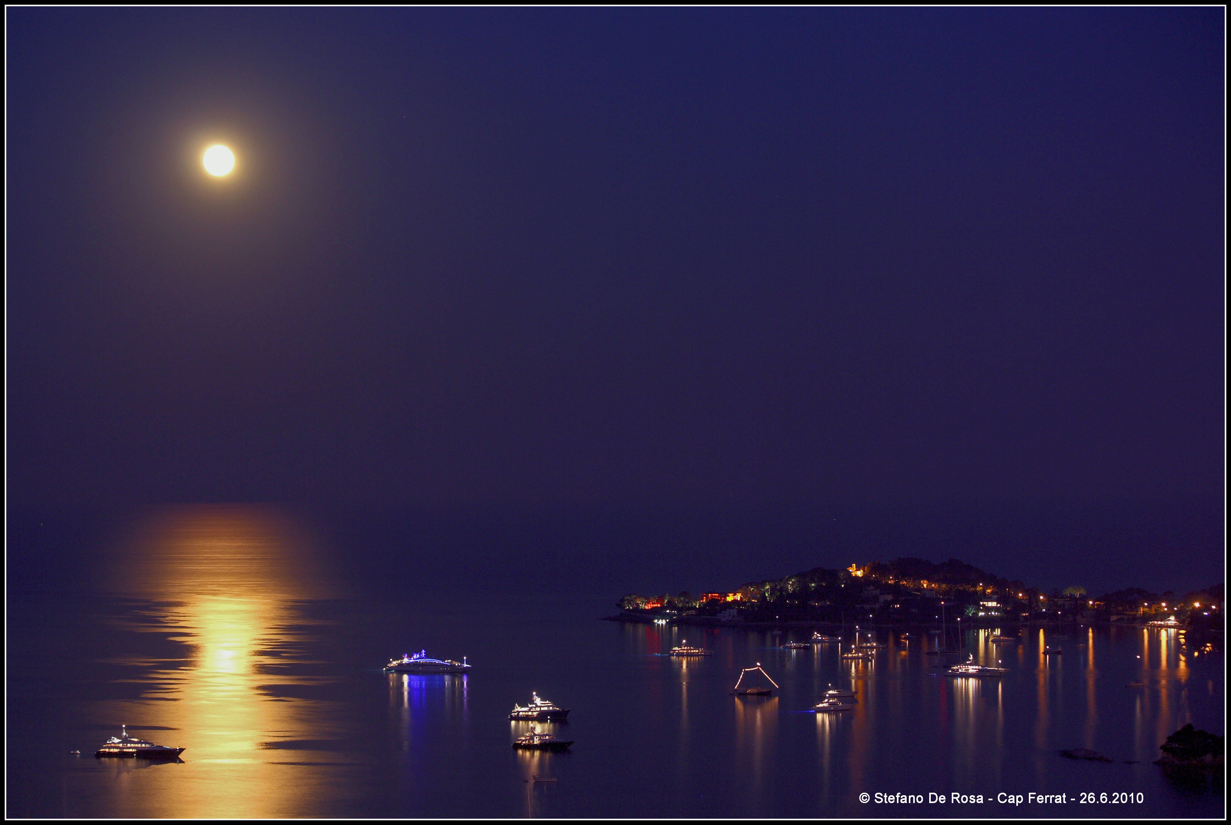


I tried my best to show the thing with the blurry horizon and some better clouds, but note that backgrounds are not my strong point.
I'm going to ignore the massive artistic flaws and just point out this "wallpaper" has a baffling resolution of 2277*1133 giving it an aspect ratio of goddam 207:103. I don't think I've ever seen a monitor with those dimensions in my life. Like Seriously Dobson, how hard is it to take a blank canvas and set it to 1920*1080 before you start drawing.
EDIT: For the record I've placed my desktop, a bog standard 1080p, against his wallpaper to show how insane this is. This won't fit on a 16:9 resolution (which the vast majority of monitors conform to) without massive cropping or squashing.


I thought the same thing. I'm also pretty sure they're not supposed to be casting a shadow.That's supposed to be rocks they're sitting on? I thought it was a big stack of hay bales. Or frosted mini- wheats.

