
CrimsonKnight
kiwifarms.net
- Registrado
- 6 de Mayo, 2015
Always trying to shame someone on Twitter, Dobson. When someone does the same to you, you throw a bitch fit for asspats.[MEDIA=twitter]610334540872175616[/MEDIA]
Ver archivo adjunto 32275
Sigue el video de abajo para ver cómo instalar nuestro sitio como una aplicación web en tu pantalla de inicio.
Nota: Esta función puede no estar disponible en algunos navegadores.
Always trying to shame someone on Twitter, Dobson. When someone does the same to you, you throw a bitch fit for asspats.[MEDIA=twitter]610334540872175616[/MEDIA]
Ver archivo adjunto 32275

I think he might have some idea that he had forums following him. He probably lumps the Farms along with "all the other trolls" since, iirc, he's never screencapped the Farms directly.Open question, does dobson know about the Farms observation of him?

the world that has Justin Beiber, Phillip Burnell, Tim Buckley, Christopher Paolini...And "here in the real world"? What is this real world you speak of? In what plane of existence do you live that people would settle with mediocre and actually pay for it?

Two big reasons why his lineworks suck:I know it's been said before but it's truly amazing how much life gets sucked out of his drawings if he proceeds on after the sketch stage. His sketches are genuinely not that bad usually. Sure the style and the content are a bit eh but they have a lot more life to them than anything he finishes up.
The coloring is a big part of it as stated, since his shading just doesn't work well, but a big part of it is his lineart as well. I really can't point out what it is about the lineart that bothers me.
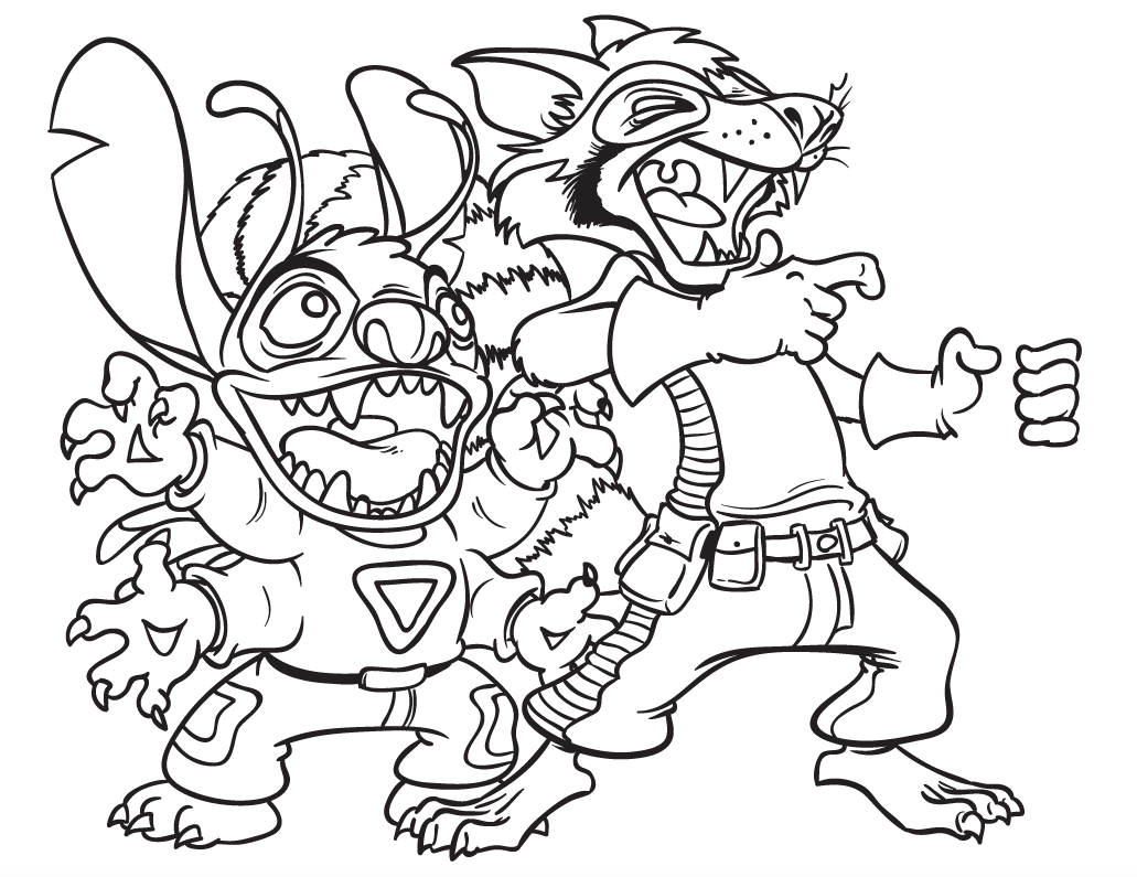
The line work is smooth enough, it has tapers and enough width differences to be decent. It just feels like he runs it through an auto-smoothing option and it just looks wrong. I think the lines just might be a little too thick for how small the dimensions of his artwork tend to be. If the dimensions of that image were half again as big and he inked it with the same line width, I think it might work better. He also generally needs to pay more attention to where things should taper off and where the lines should be thicker for certain parts of the drawing.
If that fails he might want to look into just adapting more of a sketchy style for coloring/finishing up his artwork, to take advantage of the fact that his sketches just generally look nicer.

this one ? http://eviltomp.deviantart.com/Can somebody link me to the dA account that makes fun of Dobson? I think I need a bit of catharsis this morning.


http://curtsibling.deviantart.com/gallery/?catpath=/&q=tomprestonCan somebody link me to the dA account that makes fun of Dobson? I think I need a bit of catharsis this morning.

Two big reasons why his lineworks suck:
1) He draws too many lines in certain key positions like the face. Stitch's face looks like he's made of half-melted butter or something.
2) As you already said yourself, the lines are too thick in general. It means a lot of small stuff that is supposed to be subtle ends up being way too prominent.
He should go for less lines (at least in key positions) and make them a lot thinner. Why bother drawing details when the lineworks obscure them or make them look clunky?
Another big issue with his art is image composition and the way he does lineworks also sorta relates to that. You can get along with only a few areas being really detailed as long as the composition takes advantage of those few places. Dobson throws details on his creations and hopes something sticks. Problem is: His composition always works from a strictly 2D perspective ... and even there he fails. He doesn't plan an image and try to understand how it works in 3D and tries to translate that to 2D, he merely spreads out everything on a 2D plane- I don't know if I'm getting this point across
Basically, his composition doesn't treat characters, objects and places like they are 3-dimensional. It's more a collage of 2D cutouts floating in some vague void - even when he does draw a background!
And that's where his issues with the linework really come through: Objects farther away should have thinner lines, otherwise it will look clunky. There should be a composition to guide and draw in the viewers eye. Dobson fails at this, not only in the "thinking of it as 3D objects interacting with each other" but also in the "alocate space in a 2D projection" way, so to speak. His lackluster use of negative spaces is just one further example.

So just doing the math, you expect me to post 35-70 completed works of art (comic or otherwise) A WEEK.
Dude, there are professional DC comic artists who wouldn't be able to maintain that level of workflow.
Not to mention I have a day job so... Are you completely crazy? THIS is why I called what you said "elitist." Because no sane person would feel THAT entitled to expect someone to make between 35-70 fully finished works of art a week "just because."
You want me to make that level of art consistently? Fucking PAY me to do it, cuz that shit ain't free.


[MEDIA=twitter]610486033633943552[/MEDIA]

 Never change, Dobsy.
When people criticize you, 'Break the bastard' (re-tweet)
[MEDIA=twitter]610465313403064320[/MEDIA]
